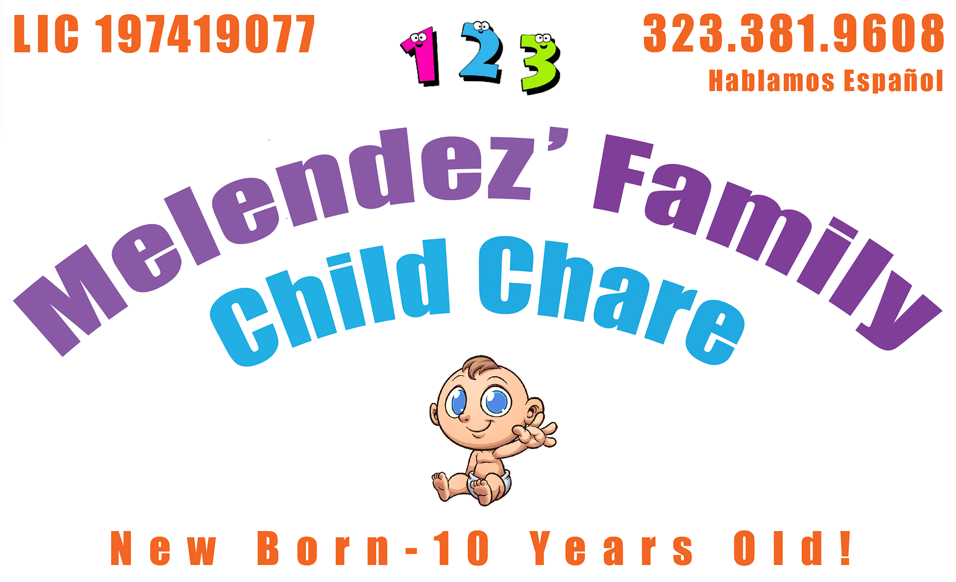
Melendez Family Child Care
Brand Identity
A new brand identity for the leader in home security emphasizes its unique human touch.
She was a mother who saw a need in her community, for a safe and loving space where children could grow and laugh. Her warmth, patience, and dedication brought families in, and what began as a small favor to neighbors blossomed into a full-time passion.
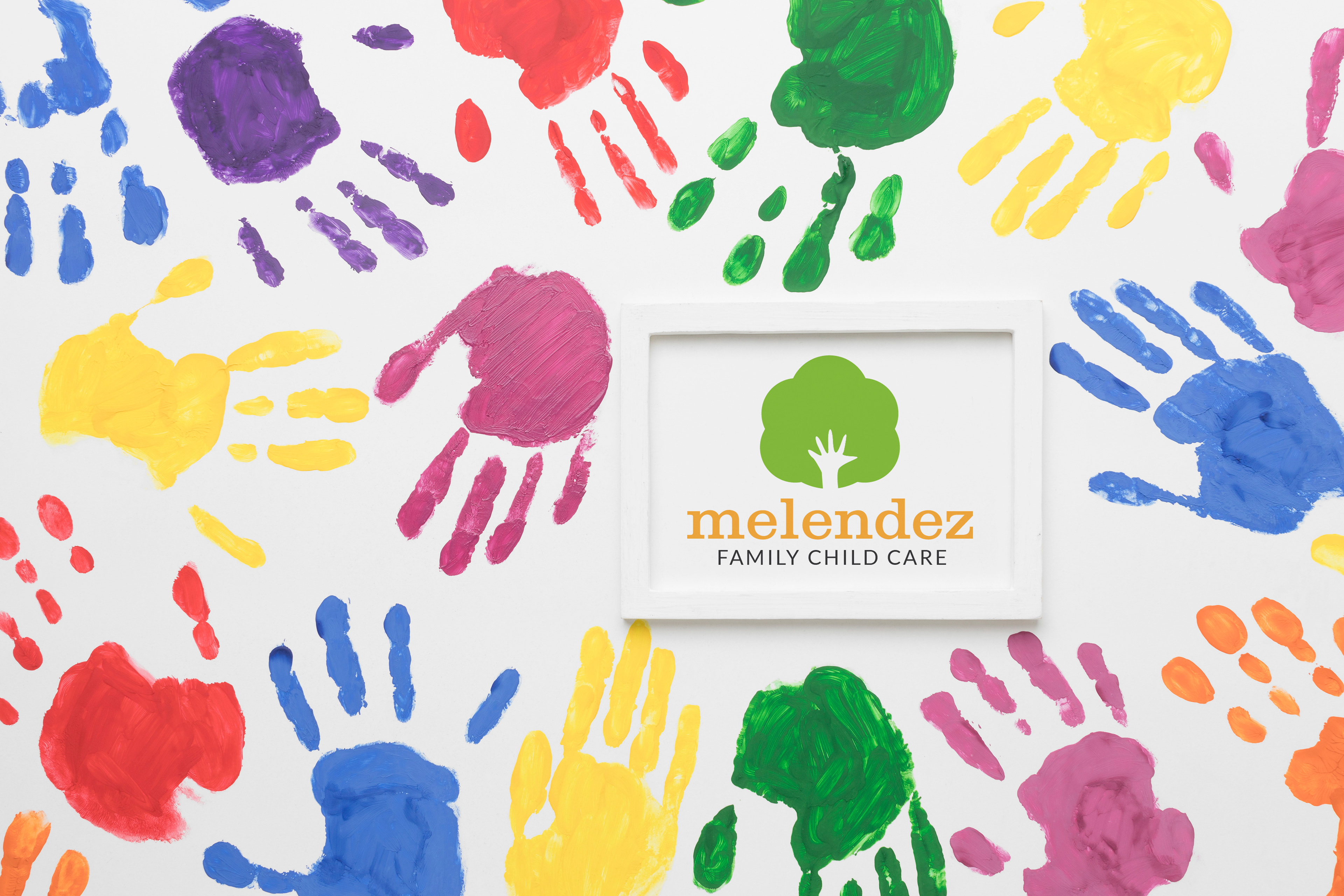
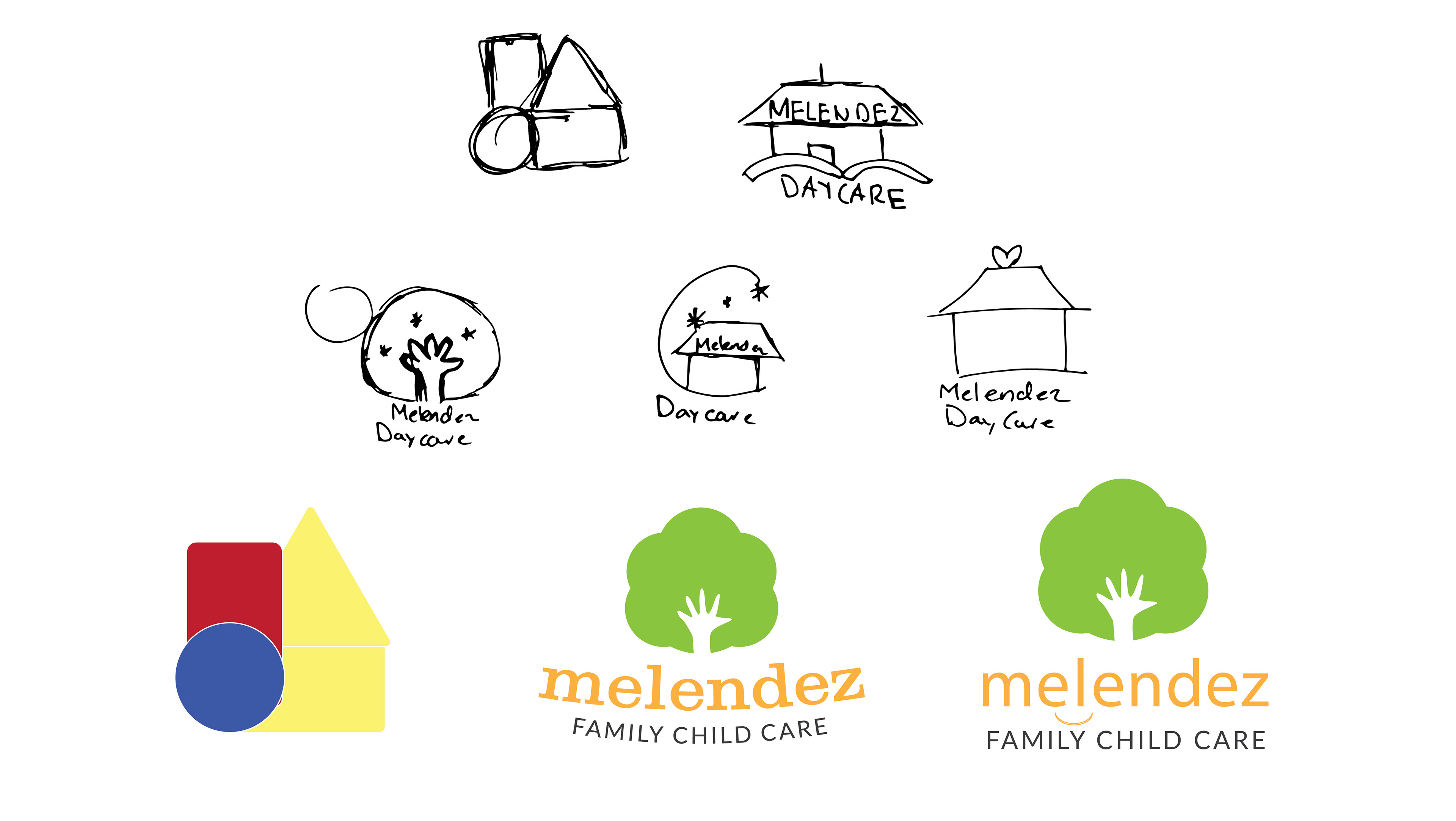
We brought the brand to life with a bold, colorful new identity. It is fun, friendly, and still rooted in family appeal. The goal was to modernize the look while staying cohesive, creating something that would catch the eye and spark joy for both kids and parents.
“After 25 years, it was time for a new look. The brand got a playful new look that is brighter, warmer, and more in tune with today’s families. While still holding onto the heart that started it all.”

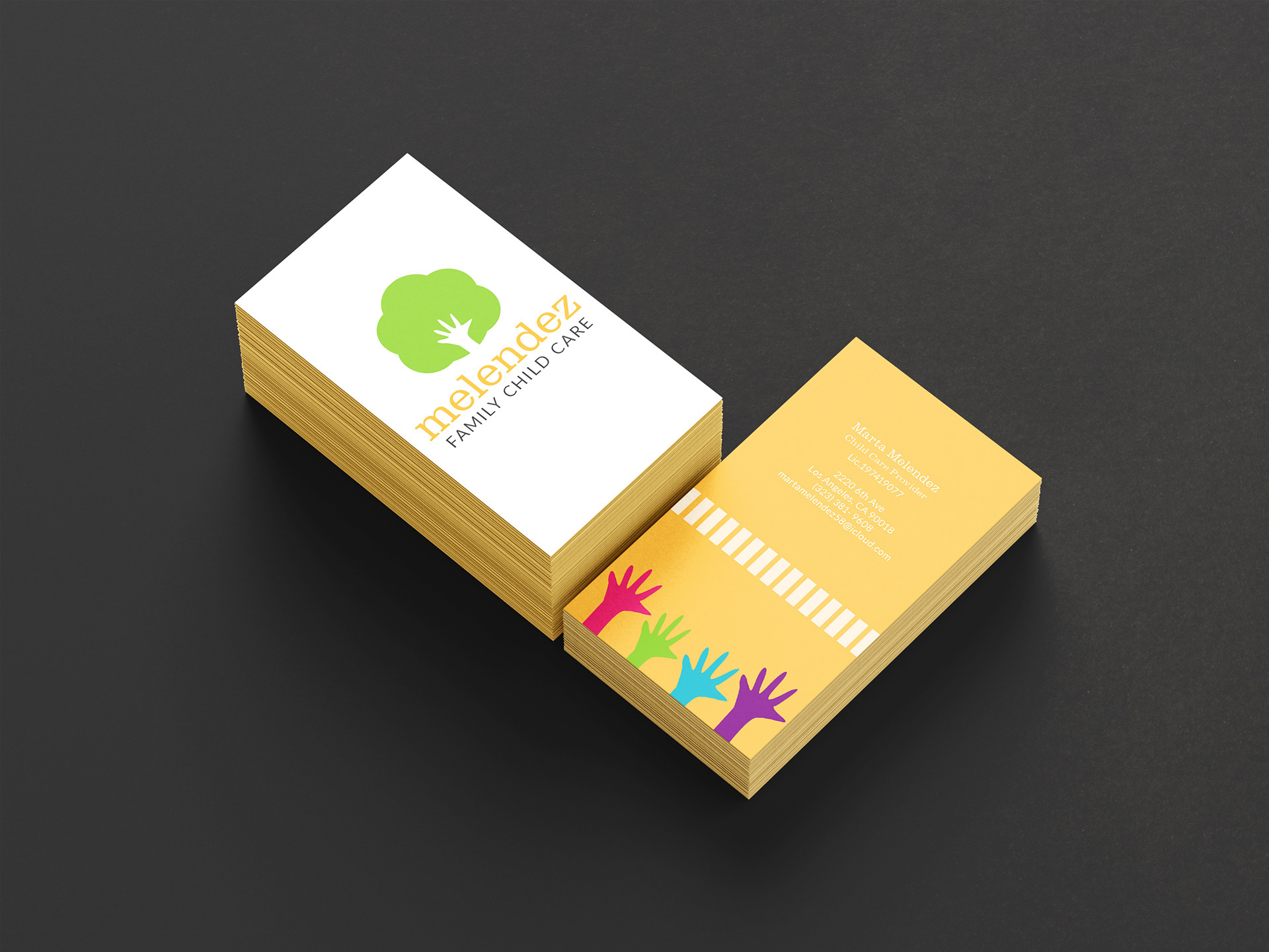
This is a selection of design pieces, including flyers and business cards, each thoughtfully developed to reflect the client’s brand vision. The overall aesthetic is friendly, approachable, and tailored to resonate with families looking for a child provider.
Old Business Card